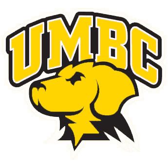
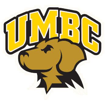
 After posts and posts and posts obsessing over UMBC's impending logo change... I'm still not done. I've said my say, ad nauseam, in fact, but I figured I'd put my money where my mouth is and give a shot at what I think I'd rather see. I've gotten beyond the fact that change is occurring and embraced that it could be a great opportunity. So below, here are a couple of thoughts of what I'd rather see.
  My main issue with the logo presented is that it de-emphasizes gold as one of our colors. With Towson, whose colors are black, gold, and white, just a couple of clicks around the Beltway form UMBC, I think utilizing the gold as more of a primary color helps distinguish us. "Recent Trends in Mascot Logo Design", which was a reference page when the school rolled out the logo choices, notes the trend of double-stroked text used; i kept this element, but instead utilized the white as the inner stroke, keeping the emphasis on the black and gold.
 The issue run into with that design, however, is the use of a gold dog. Yes, we are the Retrievers, and yes our colors are black and gold, but we are not golden retrievers. It's a mistake that already gets made, and by making our Chesapeake Bay retriever gold it only lends to that misconception. The same publication referenced above also notes the use of proper mascots instead of relying on the school colors. Using that model, here's the mockup using the brown dog, but still emphasizing the gold in the lettering.

Comments